Bob Schwartz

Category: Technology

The Ultimate Notepad?


The best reason to get a very expensive, very powerful smartphone is to have it serve as the ultimate notepad.

No. But if you are someone whose practice has been, since the beginning of time (that is, since the earliest digital days), to go around with a pocket memo book, you may have noticed that the notepad has become vestigial, like a no longer useful appendage about which you still maintain some habitual affection, even if it is no longer useful.

Smartphones are remarkable notetaking devices. Even without the added convenience of voice-to-text, with the right keyboard (recommended: SwifKey) and the right app (recommended: AK Notepad), the flash-of-brilliance scrawl has now become the flash-of-brilliance digital non-scrawl, polished, spell-checked, and ready for prime-time.

A state-of-the-art memo book (Mead top-bound) ended up squarely on a desk next to a state-of-the-art smartphone (Samsung Galaxy S2). Here are some observations.

They are both quite elegant. They are almost exactly the same size: memo book 3×5 inches, smartphone 2.60 x 4.93 inches. The memo book is considerably cheaper, less than a dollar (pen not included), while the smartphone can be hundreds of dollars, depending on the contract. There is no contract available for the notepad.

Obviously, the notepad will never run out of battery power, even if the notetaker does. The worst that can happen is that you run out of ink, at which point lipstick, burnt matches, or dozens of other things will do in a pinch. The upcoming J.J. Abrams television series Revolution is about a world where all electric devices suddenly and completely stop working. Dystopia or utopia, if this possibility lurks on the fringes of your thoughts, for eighty cents or so, you can buy an insurance policy against your most groundbreaking but ephemeral thoughts being lost forever. Seems like a bargain.

Going Naked On Your Smartphone


It is a continuing discussion among thousands of people in the smartphone world: Use a screen protector or “go naked”?

What is so glaringly notable about the debate is how much it echoes the same discussion about sex: Use a condom or go naked?

It is about sensation and response. The thicker and less sophisticated screen protectors seem to reduce the touch and responsiveness of the device.

It is about size. Many people find that screen protectors they purchase don’t fit their device, even when the manufacturers claim they do. Trimming and adjustment are often required.

It is about aesthetics. Even the thinnest and most expensive screen protectors seem to take away from the inherent beauty that has been designed into the device.

It is about messiness. One of the biggest complaints about screen protectors, even among those who choose to use them, is that they are a mess, tending to slip off and be constantly in need of readjustment.

It is about unwanted and unexpected outcomes. No matter how careful you are, screens can get scratched. Once that happens, the experience with and the relationship to the device are never the same again.

That last is a risk many seem willing to take. Maybe they can’t be blamed, because the feel of a gliding fingertip on Gorilla Glass instead of plastic, and the instant, electric response you get is like nothing else. If there’s a price to pay for going screen naked, to a lot of people it’s worth it.

MoneyDesignDigitalSex

Sometimes you stumble upon an item that perfectly embodies America, the 21st century, and America in the 21st century. All in a good way. This is from a company called Crave:

Our first product – DUET – was submitted for pre-release funding on international design funding platform CKIE.com in August 2011 where it raised $104,000 from over 950 backers – 694% of the original target. Word of DUET consequently spread across the web, which has effectively raised the profile of the product even before its official release, while also providing a springboard for further CRAVE products and developments.

Crowdfunding. Check. Design. Check.

But what exactly is Duet?

In a world where high technology and luxury design seem to touch every corner of our lives, the most intimate experiences should be no exception. The dominating culture in adult products often feels cheap and sleazy. We were craving something better: something beautiful, something discreet, something environmentally friendly, and something sophisticated. After all, if anything deserves good design, it’s the things we bring to bed with us.

Design, again. Check. Sex. Check.

But what exactly is Duet?

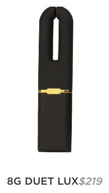
With dual motors and a V-shaped angle, DUET delivers powerful and precise vibration for external clitoral stimulation. The tip, inside edges, and outside edges provide slightly different intensities, while the flat surface is ideal for massaging the area around and on the clitoris. The dual motors’ unique ‘split at the tip’ combines with the four vibration patterns to enable a variety of sensations for you to explore…

Duet will let you how much charge remains when you turn it on. It will pulse one to four times – one pulse meaning 25% full, and four pulses indicating your DUET is 100% charged. When plugged into a USB port, a light indicator will blink to let you know your DUET is charging. The intensity of blinking will change depending on how close to being fully charged. With four vibration modes and four power levels, DUET gives you flexibility to find the perfect intensity and pattern. The settings have been designed to be easily altered at whim, but won’t accidentally change on you in the heat of the moment. Vibration modes include steady, dual pulsing, circular pulse, and wave.

Sex, again. Check. USB port??

Yes, this is Duet. A vibrator and a USB flash drive.

This is, without irony, the sort of creativity that makes America great. Purse-sized vibrators have long been around, as have flash drives. But this story that combines cutting-edge financing through crowdfunding, high-level design, digital capability, and, of course, sex goes well beyond bringing together chocolate and peanut butter. This is American genius.

The Spotify Cover Game


Note: Two online music services launched in 2006, one in Palo Alto, California, one in Stockholm, Sweden. Both shared a vision of offering on-demand, track-by-track access to streaming music. Lala, the American service, was a simple and usable platform. It was offered free, and was based on an evolving business model that had something to do with future subscriptions and music sales. It was a wonder. In 2009, Apple bought the company, possibly to integrate the platform into a future streaming service of its own. That vapor service never materialized and, instead, Apple killed Lala.

At the same time, Spotify was developing its own more sophisticated service in Europe. Music licensing held up its introduction in America until 2011. Lala lovers, still smarting from its demise, have to admit that Spotify is indeed everything Lala was and more. Spotify is flourishing, though it still has to prove the viability of its business model, but we enjoy it while it lasts. Maybe Apple will buy it and kill it too. Sorry—still a little bitter.

Spotify has changed the way we listen to music. What music lovers hoped would happen in the future happened: Click on a track, there it is on your computer. The future is here.

Spotify enables a lot of listener creativity and sharing. There are thousands of playlists created and available. Of course, commercial media, artists, and labels are drawn to popular platforms like moths to flame, and there are now plenty of those generated playlists too.

Spotify also allows unlimited exploration and discovery. Among the unique paths is what might be called the Spotify Cover Game. You can choose any song and listen to nearly every version of it ever recorded, minus the small number still unlicensed and unavailable.

The Spotify Cover Game is fun and educational. To try it, take any popular song from any era. Search for the track, and the results will list all—sometimes dozens—of the recorded versions from different artists.

To demonstrate, Mad Men fans might pick The Beatles’ Tomorrow Never Knows from Revolver. (For non-Mad Men fans, this is the track that in a recent episode young and sexy Megan Draper plays for her older and sexy husband Don Draper to introduce him to the Beatles in 1966.)

Here is a very partial list of artists you can hear performing Tomorrow Never Knows on Spotify:

Phil Collins
Junior Parker
Jimi Hendrix
Michael Hedges
Danielle Dax
The Pink Fairies
Cowboy Mouth
Wayne Krantz
Living Colour
Trouble
Monsoon
Tangerine Dream
The Mission UK
Dwight Twilley
Herbie Hancock & Dave Matthews
Dweezil Zappa
Grateful Dead
Phil Manzanera

The proof of the song is in the covers, and Tomorrow Never Knows doesn’t fail. Whether vocals or instrumental only, it pushes artists to rise to the occasion as they aspire to recreate a cultural milestone.

Best: Herbie Hancock and Dave Matthews. A surprise, given the competition from Jimi Hendrix, Living Colour, and others, and given that neither Hancock nor Matthews are noted for this kind of psychedelia.

Worst: Grateful Dead, hands down. They are noted for their psychedelia, but in this particular live version from a 1992 concert in Oakland, the vocals are literally unlistenable and the music isn’t all that great either. Probably better the next night or if you were really high.

Most Interesting: Legendary bluesman Junior Parker, who recorded it as part of a Beatles album. His smooth and full-bodied voice is in stark contrast to the usual ethereal takes. Accompanied by a spare arrangement of hypnotic bass with a touch of guitar and keyboard, this is a perfect realization and transformation of the original. One of the most interesting Beatles covers ever.

In addition to hearing the multiple ways that the strongest songs are treated, the SCG—and Spotify itself—is about serendipity, the exploration and discovery of unheard artists and tracks. The Hancock/Matthews track, for example, is from a 2010 collection of collaborative covers called The Imagine Project (containing Imagine, but it’s not a Beatles-only collection). There you will find a cover of the Peter Gabriel-Kath Bush anthem of hope in hard times, Don’t Give Up, with John Legend and P!nk performing. Nearly (only nearly) as good as the original, it is mesmerizing, heartbreaking, and uplifting at the same time:

No fight left or so it seems
I am a man whose dreams have all deserted
I’ve changed my face, I’ve changed my name
But no one wants you when you lose…

Moved on to another town
Tried hard to settle down
For every job, so many men
So many men no one needs

Don’t give up
’cause you have friends
Don’t give up
You’re not the only one
Don’t give up
No reason to be ashamed
Don’t give up
You still have us
Don’t give up now
We’re proud of who you are
Don’t give up
You know it’s never been easy
Don’t give up
’cause I believe there’s a place
There’s a place where we belong

That’s the Spotify Cover Game. Try it. Enjoy. Explore. Discover. And don’t give up.

Breathing and Relaxing with the Department of Defense

The U.S. Department of Defense might seem an unlikely place to look for cutting edge technology to relieve stress and promote psychological well-being. That is exactly what you find at The National Center for Telehealth and Technology (T2):

Our mission is to lead the development of telehealth and technology solutions for psychological health and traumatic brain injury to improve the lives of the Nation’s Warriors, Veterans, and their Families. T2 seeks to identify, treat, and minimize or eliminate the short and long-term adverse effects of TBI and mental health conditions associated with military service.

Out of this work, T2 has developed some remarkable mobile apps , aimed at military communities, but available and valuable for anyone. Two of these will be of particular interest to those who believe that simple breathing techniques are a primary key to psychological health.

Tactical Breather and Breate2Relax are simple yet sophisticated tools for an instant, easy-to-follow exercise of breathing for stress reduction and relaxation.

Tactical Breather is the much simpler of the two apps and techniques, involving just a four-count system of inhale, hold, exhale, hold. Along with the onscreen prompts and guiding voice, there is an introduction and tutorial.

Breathe2Relax is more comprehensive in terms of supporting text, videos, and UI, offering a host of options for the interface: beautiful background images (including photos from NASA and NOAA),  relaxing background music (with titles such as Ambient Evenings and Evosolutions), and more. The deep breathing exercise is simply inhale/exhale, and you can change the length of each breath (default is 7 seconds) and the number of cycles for the exercise (default is 16). Coolest of all is a floating body scan animation about the effects of stress, showing a virtual human with highlights about organs and systems that are compromised by stress—with all the flash and special effects you would expect from the Pentagon.

At some points, the apps reflect their military origins and mission. In Breathe2Relax, a Wellness Tip suggests that “Problems with drinking and drugs can be tough to work through on your own. Talk to a chaplain or health care professional.” On the one hand, this gives a non-military user—no matter how beneficial the app is for everyone—the feeling of intruding someplace where civilians don’t belong. But then again, using the apps may be a strangely good reminder of a price we ask our military members to pay. These and the other interesting apps from T2 are twenty-first century ways of making their situations a little better. That others of us get to share in the benefit is a bonus.

Hey, You, Get On Your Own Cloud


The PocketCloud Explore app from Wyse Technology has won numerous awards, including being named LAPTOP Magazine’s Best of Mobile World Congress 2012. It deserves consideration as one of the best apps of all time, for choosing to do something so essentially simple so well.

The Cloud is supposedly the digital version of heaven. Your stuff will be out there, floating around, accessible wherever you are. Your stuff gets there either by your effort or, more frequently now, by being automatically synced and transported there.

Of course, there are challenges. Space in The Cloud is not unlimited and not always free. And many of us still have all our stuff on an old-school legacy device known as a PC, a machine surprisingly spry and popular for a technology reportedly on its last legs. Wouldn’t it be great if our PC could be our own personal and private cloud? Now it can.

As Wyse describes it:

Your Stuff…Your Device…Your Cloud!

PocketCloud Explore brings an intuitive view of your Windows/Mac file systems to Android and iOS smartphones and tablets, and lets you search, view, organize, and share across all of your computers.  It enables you to create a personal cloud out of your computers plus an online “Cloudbin” (PocketCloud Web beta) for anytime, anywhere access and sharing.

“Create a personal cloud out of your computers.” This sounds too good to be true or, as is the case with so many ambitious apps, too complex and difficult to be smooth and painless—or to work at all. But five minutes later, after installing the desktop companion software and the mobile app, an entire PC hard drive was accessible on a smartphone—to seamlessly access documents, books, music, videos. Your 32 GB (or less) mobile device is instantly your 500 GB PC.

That is more than a cloud. That is digital heaven.

Permissions, Privacy and App Reviews

In the ongoing battle between your privacy and mobile app developers seeking—and getting—your permission to access personal information about you and your life, you are losing.

Millions of people reflexively agree to permissions that go far beyond the functional needs of particular apps. Sometimes it is because users don’t bother looking at permissions lists, or don’t understand all the permissions. Sometimes it is because the permissions requests are strategically placed: while Google Play includes a Permissions tab on its Web site, the mobile site doesn’t include Permissions at first screen, instead revealing it only after the Download button, when the Accept & download button appears. Sometimes, maybe most of the time, it is because users just don’t care, particularly when apps are free, and it seems that permissions, however onerous, are simply the price to pay.

The reasons to care are the subject for another time. But there is a critical way which this may be rebalanced right now, if just a little bit.

Few reviews, from big media reviewers or from user comments, ever mention permissions as a factor in recommending or avoiding particular apps. For example, and by no means singling out any reviewer or app developer, this morning brought a glowing review from Lifehacker about the new version of the  Springpad app:

Use Springpad as Your New Personal Assistant: Get Organized, Save Money, and Have Fun Being Productive

There seems no doubt that Springpad, especially in this latest iteration, is a creative app in a very crowded field. But looking carefully at permissions, you find the list above.

This isn’t to suggest that these permissions are or are not directly related to the functionality of the app or to subsidiary commercial support from advertising and marketing opportunities. And there is no implication that anything malicious is intended.

The point is information. Whether or not it is to a developer’s advantage to have users pay close and continuing attention to app permissions, it is definitely to the users’ advantage to do that.

Which brings us to a modest—and a slightly less modest— proposal.

Responsible reviewers should at least begin including some form of permissions listing in their reviews. This could be as simple as a shorthand list, something like the ratings for movies and television:  PV (Pictures and Video), RC (Read Contacts), RP (Read Phone), and so on.

The next step would be for reviewers to evaluate permissions in two detailed ways. One is to write about how necessary (or unnecessary) the set of requested permissions is to the functionality of or commercial support for the app. The other is to compare similar apps relative to the intensity of permissions. It’s true to that no two apps are exactly alike, but if you try sometime, you just might find that very similar apps request vastly different access rights.

The issues of mobile privacy are not going away. As the user base grows, as the commercial stakes get higher, and as sophisticated data strategies evolve, things are going to get much more complicated. Having reviewers keep permissions front and center is a small but valuable step in keeping users aware and vigilant.

SketchBook MobileX App

Two points.

Of the hundreds of thousands of mobile apps, free and paid, so many fail because of poor usability, lack of sophistication and polish, or because they are asking for permission to take over your phone and life.

The second point is that the idea of being able to sketch on your mobile display seems questionable. On a tablet, fine, but drawing with even the tiniest finger on eight square inches of screen may be like swimming in your bathtub. And yet, when the visual urge strikes, it would be nice to be able to realize it, however small and unoptimally.

This brings us to imaging and design giant Autodesk. From its beginnings with Autocad, the gold standard for computer-aided design, it is now a billion dollar company engaged in all sorts of digital initiatives. While most are commercial, it has been dabbling in consumer software. A few years ago it acquired Pixlr, a photo-manipulation app superior to Instagram, but obviously less well known.

Autodesk has also developed a line of drawing software called SketchBook. They offer a paid mobile version for phones and tablets. But they also offer a very capable free version for both platforms. The phone version is SketchBook MobileX, If you think that the world’s leading computer aided design company would create a mobile app reflecting that expertise, you would be right. While the paid app ($1.99) offers expanded capabilities, the free version should be enough for most people with an artistic finger and an inspiration.

The balance between capability and elegant, intuitive user interface is exemplary. Some users quibble about the learning curve, and there is an included tour and help function (here is the PDF of the user’s guide). But mostly, a little attention and adventure are all you need. The UI itself is a piece of design brilliance, and may be some of the best use of tiny digital real estate ever.

The final commendation for this should-have app is that Autodesk has done what every developer—multi-billion dollar corporation or one-person shop—should do: request only those mobile permissions needed to run the app (in this case, just network communication and storage).

Women Who (Don’t) Develop Apps

Why are there so few women developing mobile apps? The numbers haven’t yet been established, but the guess is that out of the literally million apps already created, and more on the way, few are developed by women.

The app world is one of the most fascinating phenomena in technology. It is in some ways an extension of the old school software development model, and bears some similarity. But a number of things are different. Development is easier, creativity is open, distribution is seamless and global (thanks to the apps markets), and the user base is expanding exponentially. The scale of the resulting tech opportunity is mind-boggling.

One more thing: it is a transparent development world. Many of the most popular apps (popular as in millions of downloads) are the work of one person. It is, even more than in the early days of computers, a place for garage developers, the equivalent of the garage band model of rock. And in many cases, we know exactly who that person is, because the market allows us to communicate directly with him. And, anecdotally, it is almost always a him.

The thought is prompted by the continuing drumbeat that women are severely underrepresented in STEM (science, technology, engineering, math). The focus is properly on the failure to cultivate and use so much needed talent in our always needy enterprises. But app development is also an enterprise, a remarkably democratic and free market that is now an inextricable part of daily life.

Discovering the extent to which women don’t develop apps, and the reasons why, may hold a key to the entire women and STEM debate, as well as to bigger issues of emerging consumer tech. In any case, it is an intriguing and fun question. As to the question of whether women can develop apps, the garage rock analogy is useful, if not entirely encouraging. It turns out that women actually could rock pretty hard, given the opportunity. But in a boy’s club, that continues to be a struggle to this day. Let’s hope it goes better for app development and next gen tech.

Microsoft and the Mobile OS Nomination

To spin a political metaphor, in the race for dominance in mobile OS, Microsoft is the candidate with the resources and the organization who can’t seem to close the deal.

It’s not that consumers don’t like Microsoft, although many don’t. It’s a complex of factors with this outcome: the race is down to two candidates – iOS and Android – and it is likely the two will dominate and coexist for a long time.

The field began with so many candidates now gone or barely hanging on, including WebOS, Symbian, and others. Microsoft remains confident it will be a major player. In so many of the other competitions, their sheer presence and heft has assured their victory. Windows has had to share a bit of the personal computing world with slicker, sexier Apple, not to mention the third-party Linux, the Ron Paul of OS. Along with that PC dominance came a near-monopoly on office productivity; for as many times as Microsoft remakes Office, each time more over-complex and confusing, it is still the standard. Even in browsers, where it appeared that IE would end up relegated to minority status, Microsoft could afford to hang in there and claw its way back. It has won more than it has lost, and believes it is entitled to stay in any race.

It may, therefore, be too early to completely count Microsoft out of the mobile OS race. It is partnering with Nokia, arguably the coolest phone maker on the planet (yes, maybe cooler than Apple), which is abandoning its long use of Symbian OS in favor of Windows. But as much as Microsoft puts into the effort, as many good reviews and fans as the Windows mobile OS wins over, it is too little too late.

Maybe in this case there is a “rule of two” for mobile app development and consumer adoption, rather than the usual rule of three. Developers have been willing to port their iOS apps to Android, though it remains a work in progress, as the differences between the OS continue to present challenges. Developers are already balking at adding a third version to the mix, given that Windows is also different and hasn’t yet demonstrated market share, if it ever will.

Two things we know about politics: the best candidate doesn’t always win, and money and organization may or may not be able to buy an election. Over the years, Microsoft has managed to push aside some very capable and innovative software. But that’s how it goes: the technology business isn’t “beanbag.” Maybe Microsoft has something really special to offer with Windows mobile OS. But millions of consumers may not care, and will never get the chance to find out.